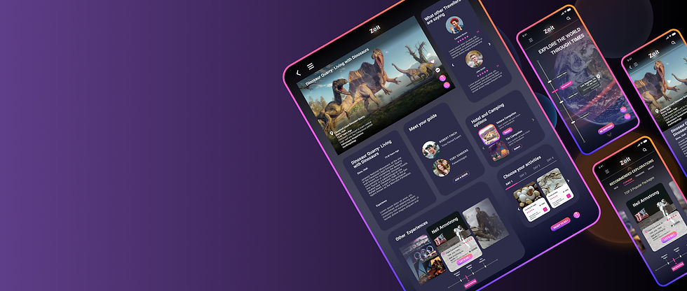
Zeit Time Travel
Responsive website that allows customers to easily make time travel bookings
DesignLab UIUX 2021
--------------- OVERVIEW
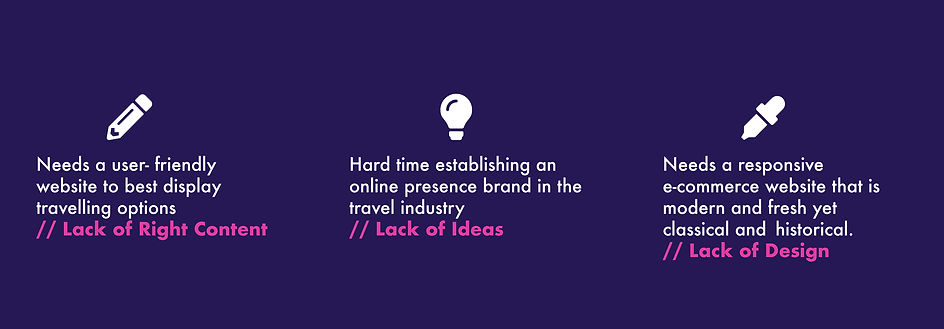
With travel and experience being so advanced than it ever has been, ZEIT is having a hard time establishing an online presence brand in the travel industry and need a user- friendly website to best display travelling options.
ZEIT is time travel agency founded by Richard Branson’s Virgin Empire in partnership with Elon Musk. ZEIT travellers are enabled to travel all over the world to 289 destinations from prehistoric times to present times. Booking processes will be no different from regular travel, but is more comprehensive in deciding on prior approved locations, time period to travel to and when is the date of travel.
In order to attract consumers ZEIT will create a responsive e-commerce website that is not old fashioned, has an online presence and not intimidating to use.
Disclaimer: Zeit is a fictitious brand. The project presented here are all speculative and for educational purposes only.
Role
Sole Product Designer
Research, Information Architecture, Interaction design,Visual design, Prototyping and Testing
Duration
4 weeks
June 2021- July 2021
Tools
Pen and Paper
Figma
Miro
Optimal Workshop
Maze
--------------- CHALLENGE
In order to attract consumers, what must Zeit do to ensure that its online presence and booking process is an easy and straight forward one?
My main goals for this project were to design a responsive website that provided easy booking experience to customers while rebranding Zeit to be more modern and fresh.
--------------- THE PROBLEM
--------------- DESIGN GOALS
- Design a time travel booking site that is simple and transparent with all information.
- Showcase all 289 destinations with visuals and background information about travel to them
- A time travel booking system that is curated for inclusive user experience
- Zeit travel experience to be explained in detail to gain customer trust
--------------- PROCESS
What do we need to do to create booking experience for customers who love travel?
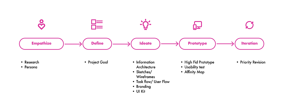
01 // EMPATHIZE
--------------- RESEARCH GOALS AND OBJECTIVES
Before I could update the logo and the design of the website for Zeit, I researched qualitative data to better understand what customers expect from a travel booking website.
Goals
-
Access people's perceptions of time travel including their expectations, concerns and fears
-
Understand how people feel about travelling and how they currently approach travelling
Objectives
-
understand motivations to book a trip
-
discover all factors involved in online booking
-
understand how a traveller decides to book travel
-
discover any concerns and biases in time travel
-
understand what makes a traveller feel accommodated when travelling
-
uncover what technology is used to enhance a travellers experience
Hypotheses
-
Interviewees will have parallel frustrations in travel booking process, since the current booking process is similar across different websites
-
Interviewees may be skeptical of time travel
-
Interviewees needs and wants will be different across different people
--------------- RESEARCH METHODOLOGY
Starting Off
I had a bunch of uncertainties starting off - one was this is futuristic and will my users understand that?
I took the plunge and started a deep dive into what is out there currently. This helped construct an effective user research plan as well for me and I ventured out to look for its market value and how Zeit would position its self amongst other competitors.
My research aimed as two important factors at this stage - Who are primary users ? What pain points do they currently face? and What is the business value?
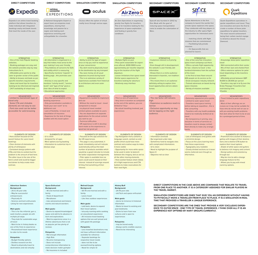
Competitive Analysis
First, I conducted competitive analysis to better understand the complex nuances of what time travel could mean and pinpoint who makes these bookings, how they make them and what they look for.
I looked at how competing travel agencies current work to analyse their marketing and design strategies. This helped me discern strengths and weaknesses Zeit could emulate and avoid respectively.
User Research
After secondary research, I sent out an initial survey to 15 participants to get general data on basic travel information.
This helped narrow down who would be interviewed during the 1 on 1 's. The results also helped curate the right questions for the interviews that followed
Once the survey was complete it helped narrow down participants for 1-1interviews.
The interviews were conducted amongst 5 participants between the age of 25-35, based on the market research and survey results. The participants were each screened for past booking experiences, what they look for when booking for travel and what how they feel about time travel. I asked them questions to uncover their motivations and frustrations when it came to travel booking and time travel.


Based on user research, participants are motivated by the following:
1) uniqueness of the product and willingness to try it
2) willing to try other options if UI is better and travel booking had less ads with a more curated list of recommendations
3) willing to switch for experience, pricing transparency and customer service.
On the other hand, participants found the booking process to lack transparency in terms of pricing and had confidence issues with respect to time travel in general.
These perspectives helped build a persona that would humanize the rest of the process.
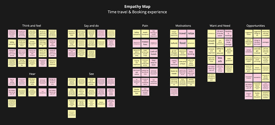
Using the research so far I decided to make an empathy map to analyse all my data so far.
Empathy Map
02 // DEFINE
--------------- BUSINESS & USER GOALS
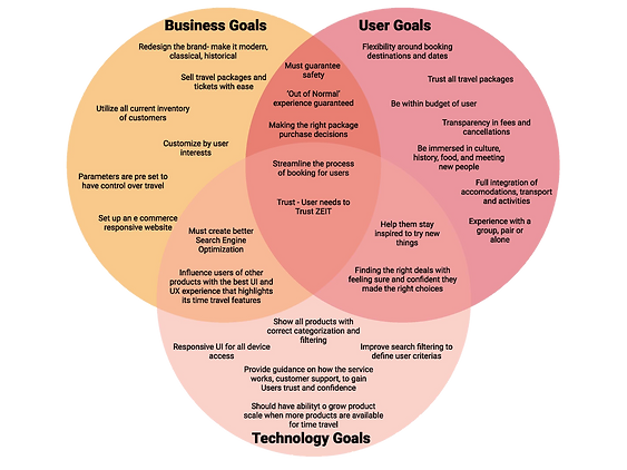
For this step to be useful it was important to set up a clear overview of Viability (business goals) ,Desirability (user goals) and Feasibility (for the business as well as for the users)
With all the research concluded and user needs now defined, project goals, objectives and strategy was next in order.
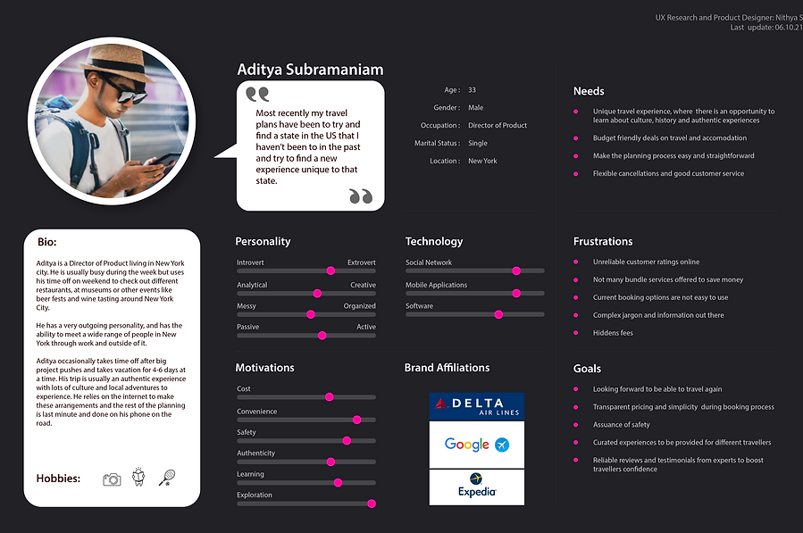
--------------- MEET ADI , THE PERSONA
The persona served as a base model for the rest of the design process and guided every decision that followed when problem solving for the user.
Using the needs and insights assimilated earlier and other information uncovered during research- the persona was created.
To ensure the site's features met the user needs, I decided to outline UI requirements by conducting an affinity mapping exercise and using the user story format to curate my problem statement.
UI Requirements
* [new possible customer] looking to [user task] and to have [user goal]
Aditya has concerns about the transparency of booking his successful travel experience
Running an affinity mapping assignment helped keep all user needs at the forefront of the planning process. This additionally prepared the foundation of the tasks before road mapping, user flows and task flows.
--------------- FEATURE ROAD MAP
At this point it was time to make sense of all the data collected to help create a navigational scheme and categorical organisation through and exercise of card sorting using OPTIMAL WORKSHOP.
This step was used to determine how a user would conceptualise/ group related items/ terms and help create some relationship to help determine and compare categories. A total of 8 participants were asked to sort through 30 travel destinations into groups that best made sense to them.
Summarised Key Findings
-
Common Categories: History, Architecture, Experience
-
Some cards were grouped together 100% of the time creating distinct patterns
-
Most users preferred Mobile devices
-
Curating of Travel experiences was another interesting suggestion
03 // IDEATE
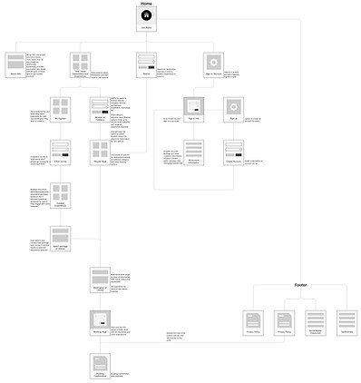
--------------- SITE MAP
Creating a site map helped determine the relationship between content categories and helped solidify what ideal site flow will be generated.
This helps understand the overall navigational goals and structure before any detail designs are discussed or designed. This also keeps the organisation intact to meet all the user needs.
Click on the image to see site map
--------------- Task Flow
When building the Information Architecture I wanted to make sure the site navigation is clear and users can quickly locate any information they need.
I synthesised the optimal sorting results and created the Task flow for Zeit
Click on the image to task flow

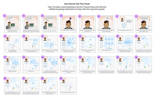
--------------- User Flow
In this final step of the "flows" stage was to create a user flow that explores how the user would make a booking based on a scenario.
The user flow will be the exact flow that is being explored navigationally before starting designs for the mobile website. These tasks were done one after the other to help keep the user needs intact.
Click on the image to user flow
--------------- LOW FIDELITY SKETCH
Based on Aditya's (persona chosen) needs I addressed some of the needs, motivations, frustrations and goals while laying out the content for the home page
This ideation phase was conducted predominantly through hand sketches and digital sketched drawings.
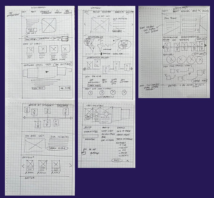
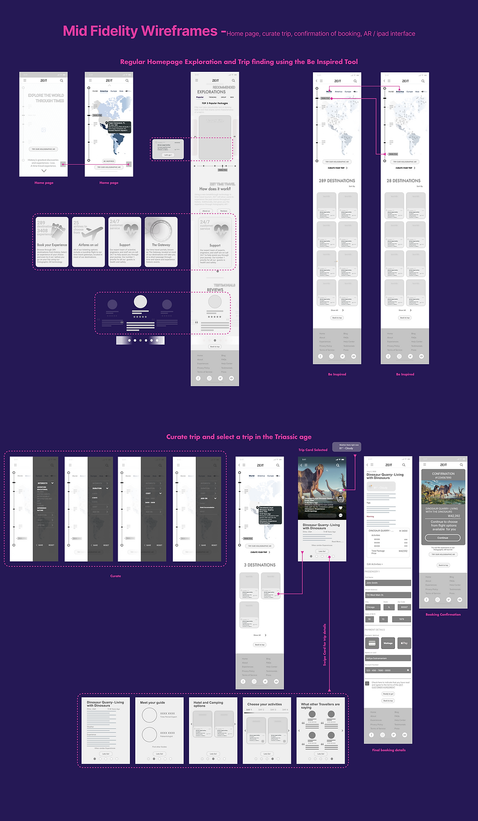
--------------- MID - FIDELITY SKETCH
Once low fid frames were finished it helped narrow down and envision what the mid fidelity frames and flow would look like.
The wire frame was developed across responsive home pages and sketches that show the flow of a user who curates his trip to make a travel booking.
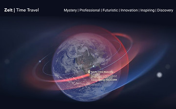
--------------- DESIGN // BRANDING
After wire framing, I focused on creating a visual brand and design for Zeit Time Travel before moving to high fidelity UI Kit creating and prototyping.
I identified Zeits brand attributes: Mystery, Professional, Futuristic, Innovation, Inspiring and Discovery. Once we have a brand identity I moved on to design a simple style tile and logo that helped drive the UI kit for the High fid prototype that followed.
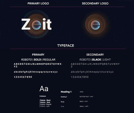
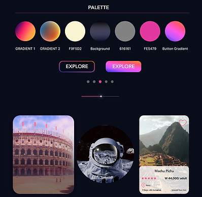
--------------- DESIGN // UI KIT
The UI Kit is created keeping in mind the brand attributes as well we style guide set up during branding

04 // PROTOTYPE
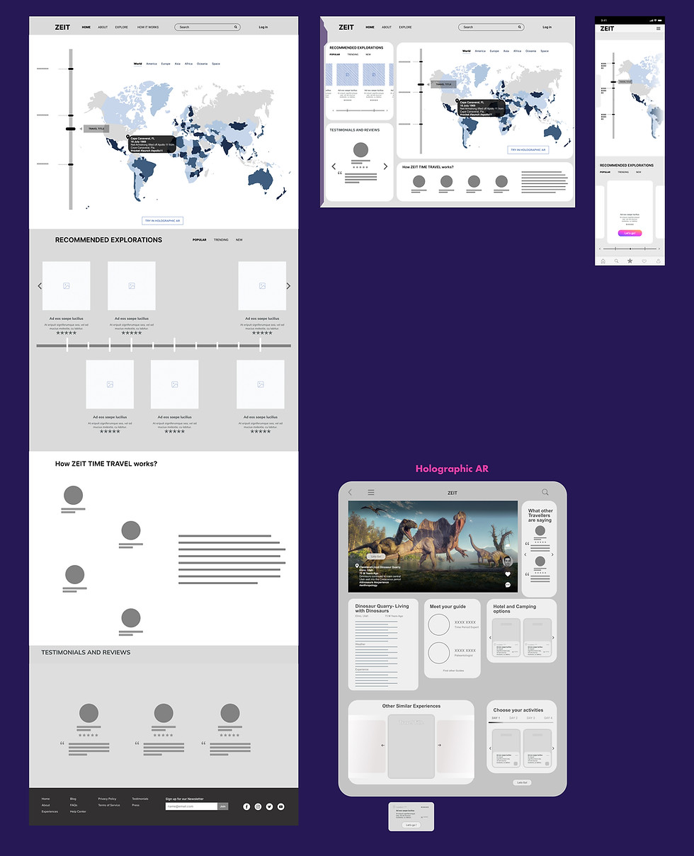
--------------- HIGH FIDELITY MOCK- UPS
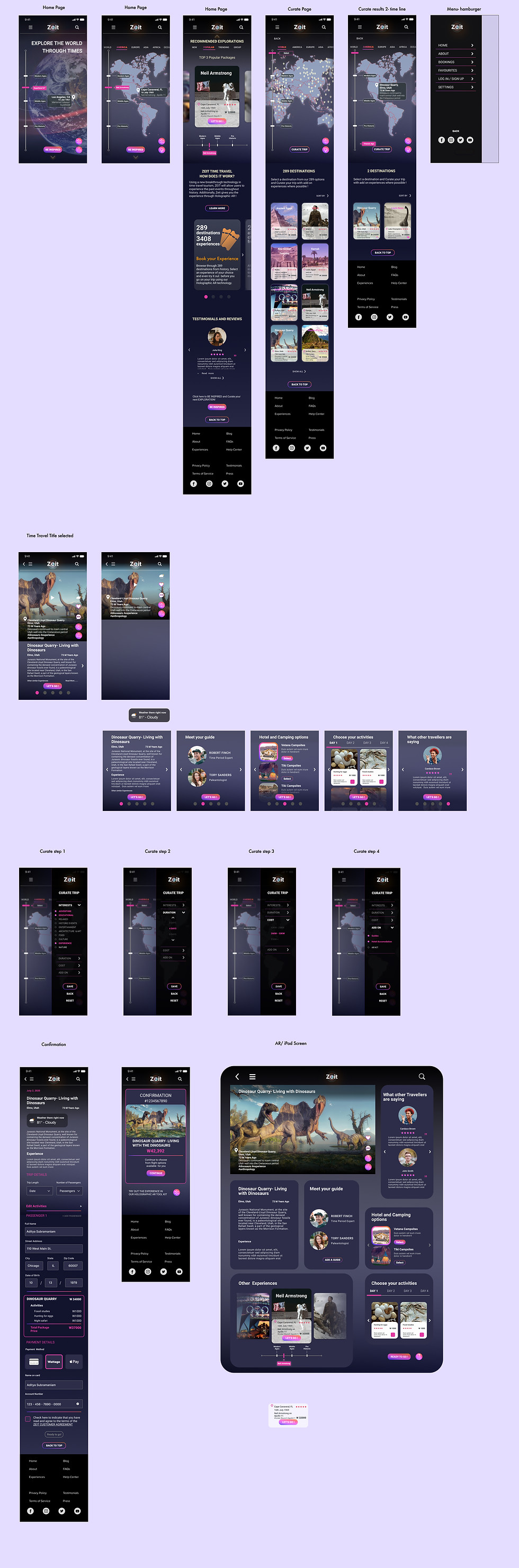
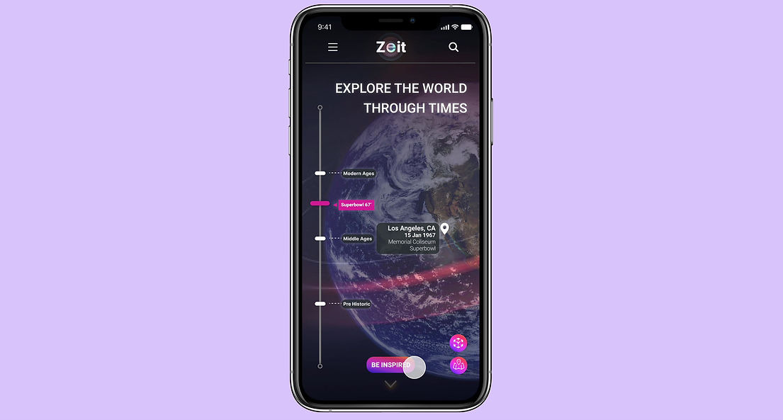
Then came time to apply all of that new branding goodness to my Mid-fi wireframes. The results (below) bring an element of mystery and innovation to what it is otherwise a very basic and content as well as image-heavy product. I was mindful not to make things too complex, though, because Zeit's reputation and dedication to travel are still very experimental and essential to their success. These frames represent the most updated version of the site prior to the usability testing the prototype.
--------------- TESTING
Then it was time for Users to test the product out!
I created a single prototype with three tasks to fulfil in Figma each of which was tailored to a specific task by mapping clickable paths onto the most recent iterations of my hi-fi wireframes, creating interactive and fully branded product examples that users could interact with.
The full prototype can be accessed here.

Home Page and learning about time travel
-
Here the user explores the home page
-
Looks at the two versions the globe or map that can be used
-
Explores Home page for other information on Time Travel
Start Curating a trip
-
Here the user begins with curating their trip needs
-
They enter - interests, duration, cost and add ons before proceeding to see their possible options for time travel experience

Make a booking for Triassic age time travel experiences
-
The user uses the time line scroll to find the Age they wish to travel to
-
After exploring the details of the trip they go ahead and make a booking
--------------- USABILITY TEST
The next step was to get user feedback on the prototype.
Using my prototype created in Figma and Maze to gather analytics, I conducted testing the usability of the three tasks I gave my audience.
The goal at this step was to uncover all the confusions the user comes across of validate and invalidate all assumptions that were made during the design and research phase of the project.
A usability test plan was created at this step and users were recruited to test the prototype through remote testing. All users were give the same scenarios and were asked to complete the same set of tasks I provided - Go through homepage, understand the app goal, Be Inspired and curate your trip, find and select your destination of choice once list is more narrowed down and then confirm your destination.
These are listed to test if the overall navigation is smooth and easy for the user and if there are any behavior issues or thought during the interaction with the prototype. I asked the users to all talk through the process while I made notes to identify the strengths and weaknesses of the project prototype.
Summary
Liked most
- Very Unique booking experience
- Process is straightforward
- Payment through Wattage
Liked least
- Bread crumbs to lead to back pages
- More information after confirmation page is reached
- Zeit Logo to take you back to home page
- Transparency always
05 // ITERATION
--------------- AFFINITY MAPPING
To prioritise revisions to the first prototype tested, I created an affinity map to help organise the feedback and understand what issues are most important to be fixed as first priority.
The patterns I saw helped me organise the results under larger brackets like user journey, booking process, navigability, design UI and frustrations.
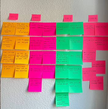
Finding patterns in the data

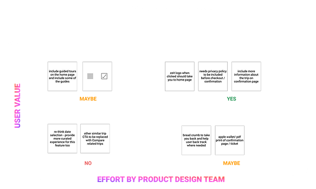
--------------- PRIORITY REVISIONS
User behavior, verbal commentary and test results helped prioritise what were the areas that needed improvements immediately.
Design revisions were made for -
-
Bread Crumbs for Zeit logo leading user back to home page
-
Privacy Policy for users to read if needed before confirmation of booking
-
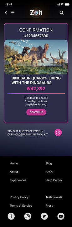
Include more information on the confirmation page about the trip
Before
After
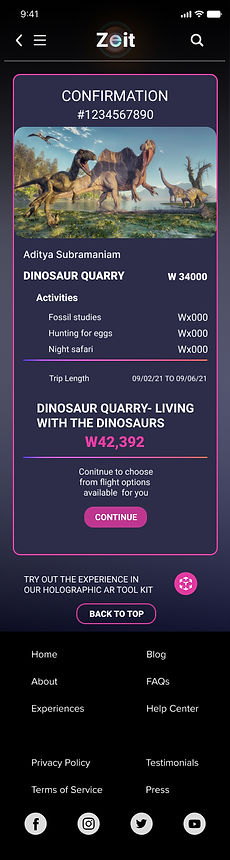
My user tests affirmed the benefits of prioritising ease of use, leaving breadcrumbs to trace back steps, bold and approachable design elements that resonates with Time Travel and access to all information at checkout
06 // NEXT STEPS
--------------- HAND OFF
With the prototype designed in Figma the handoff is pretty straightforward to the developers
Once test is conducted on all possible flows for all scenarios of users using this site that is when you can identify all areas where improvement are needed. Once the areas of improvement are revised and iterations are complete hand off to the developers is the last step.
Additionally it is important for the business to stay on top of the needs and iterate changing user needs with time.

CONCLUSION + SUMMARY
KEY TAKEAWAYS
Designing for a longtime industry player entering a new market space has many moving parts that must come together harmoniously through design for a successful end product. Transforming this established product to make it palatable to a new demographic of users requires a high level of attention to detail and a strong empathy with those new users, who approach a product that is new and unique. Tuning in to a new audience while still keeping the goals of Zeit in mind made for a challenging project that ultimately had a great payoff and an exciting design process.
CHALLENGES
-
Applying the wants, needs, and experiences of a younger audience onto a product mainly developed for longtime B2B partners
-
Simplifying the travel booking process for new users without compromising information transparency
-
Creating a brand and experience that combines that bold innovative idea with an intuitive UI design and modern and futuristic with new branding
INSIGHTS
-
There is immense value in knowing the pain points of a new user base a company is trying to appeal to before beginning design
-
Complicated products do not always need a complicated UI to complement them; oftentimes a simpler approach for a complicated product makes the product more approachable, increases inclusivity, and brings more success to the experience of every user

FINAL THOUGHTS
-
As this was my first fully responsive web designed product, I found that I struggled at points that were new to me along the way. Some research was challenging, and some design decisions became a bit paralyzing. However, I was able to push through every challenge, and ultimately created a responsive product for Zeit that I am very proud of.
-
The central foci that I referred back to throughout the entire design process was the target user base and their need for a new and improved futuristic, easy-to-understand experience with their travel booking. Using that thesis to inform every decision allowed me to focus the entire design on producing the best possible experience for them.
-
Though this project was based on a fictitious company, I feel as though the insights I gained through this design will easily be applied to future projects with real clients and better inform all of my future design decisions.