
Bulletin
A product that helps users see all sides of the news
DesignLab UIUX 2021
Overview
News is not objective. For better and for worse we are not handed down a report of the events that surround us all.
The Political Author, Journalist himself Owen Jones surmises-
"The British people are not being served by a media that exists to inform them, to educate them, much of the media is a political machine, lobbying for the often personal objectives of their owners" (The Establishments 2014:123)
Technology provides us news and information that is becoming more ubiquitous, unverified and lacking fact checks. I sought to explore the need for an application that would help consume non bias , verified information and allow people to see all sides of a story.
Role
Sole Product Designer
Research, Information Architecture, Interaction design,Visual design, Prototyping and Testing
Timeline
4 weeks
June 2021- July 2021
Platform
Mobile- end to end application
Disclaimer: Bulletin is a fictitious product. The project presented here are all speculative and for educational purposes only.

The Project
Based on the current problems in the news industry -
1. Media crisis - Financial and Ethical
The media is in crisis. Google and Facebook are taking the vast majority of ad revenue, and paying content creators far too little for the value they deliver to users. This puts high-quality creators at a financial disadvantage, and favours publishers of cheap media: fake news, propaganda and conspiracy theories, quickly re-written stories with sensationalistic spin, shady off-shore content farms, algorithmically generated content, and pirated videos.
Jonah Peretti, BuzzFeed Founder and CEO
2. Dependence on Social media and Search engines
Facebook has announced plans to fight engagement-bait and push pages and posts that post more authentic content. But another cause of worry for brands is the fact that Facebook is in the process of changing their algorithm to decrease reach of business pages and give more priority to posts by friends and family.
3. The dominance of News aggregators
With the dominating rise of news aggregators and people preferring multiple sources of news, it becomes difficult for a standalone news company app to get users to read & stick on their platform more.
"
I chose to design a tool that gives users quality news and increases their participation while reducing the overwhelming consumption of information
"
The Process
I used the Double Diamond Process to help me develop Bulletin.
The main thing I kept in mind was finding ways to make news more easily understood by people. I planned to approach this project using the design thinking methodologies by gathering goals, needs, wants and pain points for my users and using this to help guide and define my problem statement.

Discover Research
Starting Off
With this project I decided to take the plunge to solve for all the problems I personally also have with the way news is currently delivered to readers.
I set out some over arching objectives to meet and goals to helps develop a problem statement.
Before constructing a definitive user research plan, I ventured out to find other news resources and their market value position to compare BULLETIN's position amongst competitors. I conducted research aiming to find out - What is the business value? How would Bulletin make revenue? Who are the competitors currently? Who will be the primary user for such a product? What are the current pain points in my point of view as well as other users?
Goals
Over all goal is to retain users long term loyalty, lead to lasting habits for readers and build incentives amongst the sea of news apps out there, many of which are free.
-
To give personalised news and better experience to the users
-
Enhancing user experience so that they stick to the app and keep browsing more news and articles thus increasing app time and usage.
-
Fit monetisation strategies that actually work with the user experience considering the rise of ad-blockers and provide options beyond paywalls.
-
Fit in special features that are unique for different news channels and their apps.
-
Boost productivity for the users and give them exactly they are looking out for.
-
What do Users need so they dont endlessly scroll through news?
-
What resources are currently out there for people to get an un biased perspective on news and information while having the opportunity to add their own take to it ?
Objectives
-
Understand users and their current need for consumption of un biased , democratic news and information
-
Look at competitors and draw up an analysis to understand features currently out there and currently missing to create less stress in news consumption
-
Look into users current use of apps or products out there and how they consume this news- do they actually read? how often do they read completely?
-
Understand pain points, frustrations, needs and wants and draw up an affinity map when done
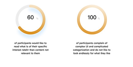
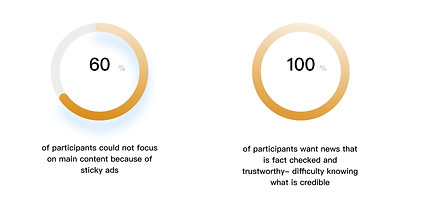
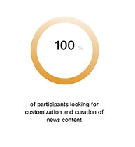
Marketplace Research
I did my competitor analysis by reading on news and applications out there, How people prefer to consume their information, Reuters analysis & other Market trends.
Since all the news apps require a premium subscription to have full access to the key features, it got challenging to figure out features they hold. Though I tried researching the premium subscriptions and what each app offered, this analysis may lack some of it and is based on online research of its features and offerings. I did the Competitive Analysis by listing all the essential features in a structured tabular format to identify the competitors and mapping out their strengths and weaknesses. I did this comparison for the direct competitors.

User Interview
With more people relying on online tools to read news on the go and more people looking for news perspectives, these user interviews helped get the right feedback before developing a feature road map.

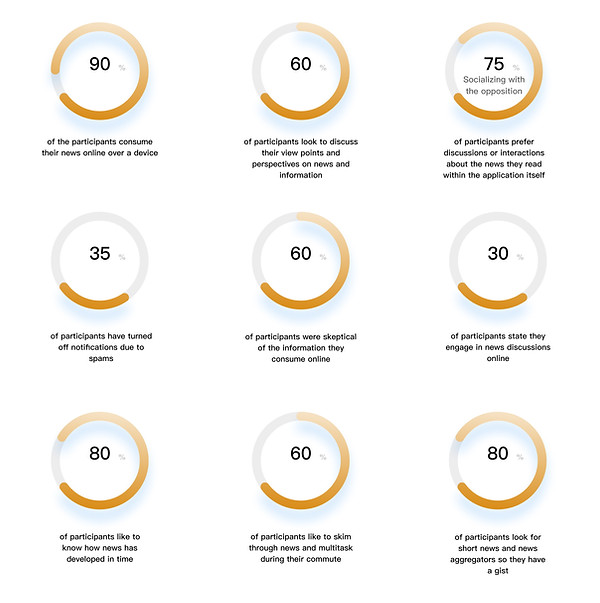
Key Insights
As a result of all the research from Competitor analysis and user studies, I drew out some key insights to help narrow my area of focus and features to solve for.
1
Important to understand how and why people justify opposing viewpoints
2
Social medias current algorithm can trap people in echo chambers
3
There is concern over the accuracy of information online
4
Trust and transparency are important values to uphold for a solution that handles news and information
5
Opinions and voices that are unbiased
6
Concerns on back tracking and tracing news developments
Define Insights
Empathy Map
With the Key Insights in hand it was now time to define the probable users of this product via and empathy map.
There are two types of readers that I wanted to find features most useful for - one a focused reader and one is a general reader. In general the over reaching goal is to solve for people looking for news that is brief and unbiased. Keeping this is mind I drew out some empathy maps based on results from my user interviews.


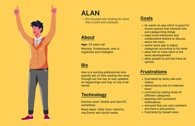
Persona
Who am i designing for?
It was important at this point to understand my target users, so I created a persona based on my research insights and put myself in the users shoes to understand all the pain and needs. I kept referring back to the personas for guidance on design decisions.
Define Problem
"
With the general growing distrust in the media and users having concerns about the truth and authenticity in the news, people are often unable to understand information and have constructive discussions about opposing perspectives. This tool allows users to share opinions and helps prevent discussions in echo chambers by giving journalism back to the people.
"
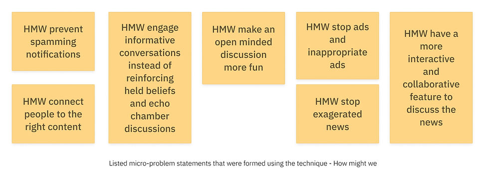
Ideate Brainstorm
Conducted a How might we design strategy technique to help narrow the problem statement and find focused elements to resolve.
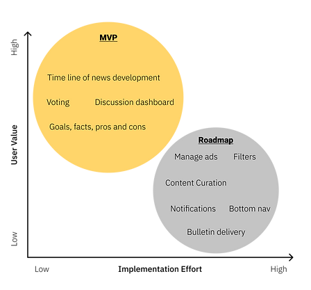
Feature Prioritisation
Based on interviews and general market research, I was able to identify a list of potential features. I was also able to narrow down and focus on what is vital to the success of a product like this. I came up with a few potential features that we could build now and some for the future
The initial user feedback speaks to the need for an easy way to deliver better content and news. Tackling the user pain points, the MVP also integrates methods to make the app easy for the users to use and methods to customise the experience.
Bulletin Core Attributes
I ran sprints to formulate early concepts of what this could be. Some of many concepts I considered were:
-
a chrome extension that identifies fallacies and misleading information
-
a blockchain database that accounts for versioning
-
a feed algorithm (similar to Facebook) that displays opposing topics, meant to combat echo chambers.
-
A decentralised system
-
A secure system
-
Wiki functionality for crowdsourced information
-
An environment that encourages open minded conversation and critical thinking while fostering mutual understanding
-
An overall reduction of biases
-
A way to back track and see how news has developed
💡 Features of this Product
-
Personalisation Page- First-time users will get an option to answer a few questions based on which the app customises the Feed of the user. The users can also edit their customisation of the content whenever they want.
-
Discussion Rooms after all articles Users will have an option to join -based discussion rooms via Chat Room . So that they can participate and have a discussion or debate over a piece of certain news or a news category.
-
Personalised Notifications- Users can set a timer on what time they want to receive the notifications from the app. They can prioritise the notifications by choosing the categories. They can also decide the number of notifications they want to receive per day.
-
Vote - pros cons - verified news unverified news - this will auto create developed news and information
-
Timeline- to trace back how news has developed
-
Contributors- Learn who wrote what and read other work by them
After I had my concept and direction selected, I began the task flow phase. I kicked off this phase with a timed design sprint using pen and paper to draw possible ways that the product could flow first. After pitching my ideas I used dot voting on the best components I would include, and planned to begin wire-framing and rapid prototyping different options.
Bulletin is a tool to help people understand all sides of the news debate and look at how the news developed.
Ideate Task flow
Task flow
Task 1:Curate your news feed
Task 2:Look for a News update of choice and read all details about it
Task 3:Add your opinion and perspective
I decided to find a way to create a User Flow that would cover all these task using the Lo Fi wireframe exercise following this

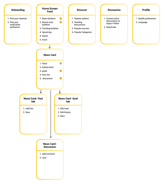
User Flow
The diagram allows you to see what the optimum flow would be
I structured the user flowchart to better understand how the features and key information would fit together for a smooth user flow. It also helped me identify bugs and missing features while doing this.
Ideate Wireframes
Low-Fi Wireframes
I created the wireframes for the app's potential UI and core features. The wireframes helped me narrow downs all the discussions I would need to potentially have with the other designers, Project managers and potential users for brainstorming further for ideas.
I structured the user flowchart to better understand how the features and key information would fit together for a smooth user flow. It also helped me identify bugs and missing features while doing this.

Ideate Design
Brand UI Kit
Keeping in mind the users requirements of a straightforward UI to help them navigate easily as well as a Kit that is memorable, desirable and informational will help make the user flow smooth
Its also important to note at this stage I conducted some guerrilla tests to see what icons would be redundant and how can could create a prototype from here to reduce the number of screens. The test results also help me learn what nomenclature was working and what iconography was usable in the tool.

Ideate Prototype
Hi Fid Interfaces
It was then time to apply all that new branding and UI elements to the mid fi wireframes. The UI gives an element of clean, instructional, straightforward and clear content as well as high res imagery to define the news itself. I was mindful to find ways to simplify the product to the bare minimum to help the tool be successful.
These frames represent the most updated version of the site prior to the 2nd round of usability tests I conducted usability test the prototype.
Below after the prototype testing you will see the iterations that was done to edit and improve the user flow through the product
Bottom navigation
-
Feed- This screen allows you to see all new new bulletins that you have subscribed or included in your preferences. Additionally it shows you upcoming bulletins you have included in your preferred categories. The saved bulletins allows you to see all bulletins you have either set aside to follow or read later. Trending bulletins allows you to see other boards that you are not following but are followed by most people using Bulletin took. Court allows the users to follow decisions being made at the senate level and other political decisions being made outside of your preferred news. Read bulletins allows you to explore what you have already read and skipped, over the past week ,the week before and today.
-
Profile- This tab allows users to revisit their settings for notifications and other preferences they may or may not have.
-
Discover- In this tab the user can explore all current trending happenings out there, popular authors, sources, discussions etc.
-
Discussion- Here are all the discussion you currently follow for news updates and discussion boards you are part of to learn more about peoples perspectives.


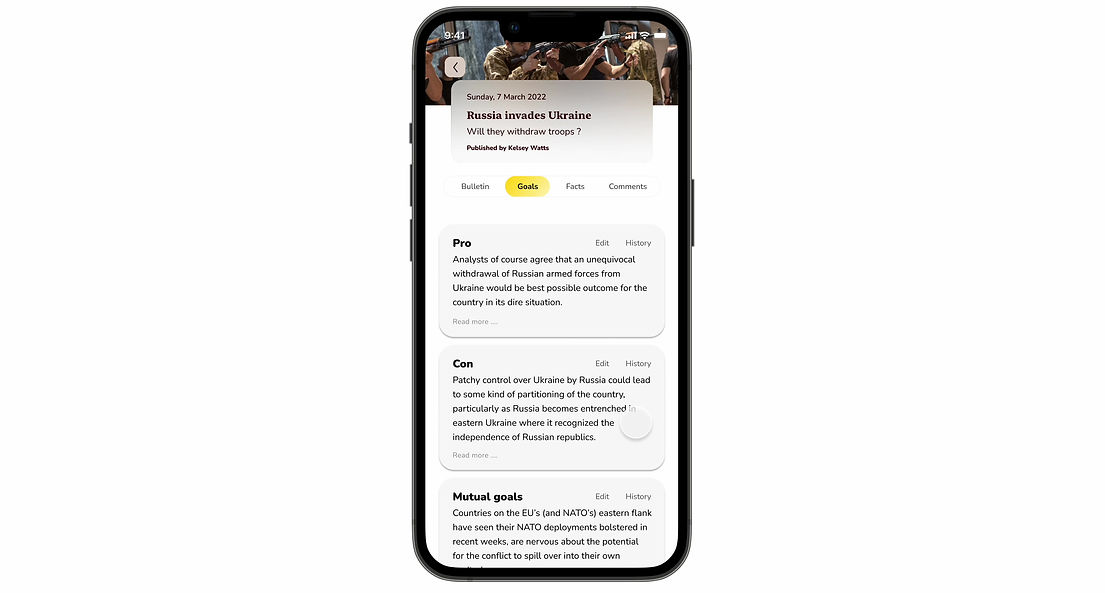
Goals
-
Goals- Here the user is given a broad perspective Pro and Con and Mutual goal based on the brief before- this is generated by ML data to allow the user to see all perspectives in an unbiased manner.
-
Edit Goal- The PRO,CON and the MUTUAL GOAL itself can be edited by users if they think the information can be further corrected.
-
History- This history of edits also is available to the user to review if needed.
-
The option to return to the original also exists giving the major part of journalistic power back to the audience.
News Bulletin
-
News Bulletin- Here the news basic bulletin brief is available to the user to understand the unbiased current happenings. On this tab you have the opportunity to book mark, and share the article. This brief is generated back end by the platform SME to give a highlight to the Users
-
Time line- you have the option to look at how the news has progressed or developed so far
Facts
-
Facts- Here the user can see all the facts added by other readers and can vote to precisely allocate them under TRUE, UNVERIFIED and FALSE that is generated after people have caste their vote- this is also a live board and can change based on how the voting changes.
-
Add fact- There is an option here to add fact and users can allocate them as a pro or a con and before this get voted on it will fall under the UNVERIFIED category. Once people vote it will be moved to either the True or False groups.
Comments
-
Comment- Here the user can see all the comments and discussions happening under this news bulletin/ topic
-
Add comment- There is an option here to add a comment.
Ideate Testing
Then it was time for Users to test the product out!
I created a single prototype with 5 short tasks to fulfil in Figma each of which was tailored to a specific ask by mapping clickable paths onto the most recent iterations of my hi-fi wireframes, creating interactive and fully branded product examples that users could interact with.
The full prototype can be accessed here.

Home Page and exploring the bottom navigation functions
-
Here the user explores the home page feed
-
Looks at the read bulletins- (iteration done to this version)
-
Explores his Profile, Discover tab and Discussion tab

Selects news bulletin on Russia and Ukraine news
-
Reads the brief of Russia and Ukraine news
-
Looks at the time line and news develpement
Selects Goals
-
Reads the Pros and Cons as well as Mutual Goals
-
Goes to edit the Pro goal and look at the history of edits

Selects Facts
-
Reads Pro fact under True news facts tab
-
Votes to agree with this point of view
-
Looks at sources and history

Selects Comments
-
Reads the comments on Russia Ukraine news so far
-
Adds a comment
Prototype Test
Usability testing results
The next step was to get user feedback on the prototype.
Using my prototype created in Figma and Maze to gather analytics, I conducted testing the usability of the 5 tasks I gave my audience.
The goal at this step was to uncover all the confusions the user comes across and validate and invalidate all assumptions that were made during the design and research phase of the project.
These are listed to test if the overall navigation is smooth and easy for the user and if there are any behavior issues or thought during the interaction with the prototype. I asked the users to all talk through the process while I made notes to identify the strengths and weaknesses of the project prototype.
Summary
Liked most
- Very Unique way to explore news
- Process is straightforward
- Allowing the user to vote and generate data which other users will now look at
- love that they can edit what they see
- They like that they have a timeline to see who news has progressed
- They like the discussion platforms as well- opportunity to actively debate and participate
- Allowing them to see the allocations of what is true and false and unverified was also so honest in general and unbiased - which other news platforms don't allow for
Liked least
- They were confused with why the read bulletins was not accessible on feed
- They did not like some elements of the UI - the yellow toggle on Upcoming bulletins was confusing for most
- Very few had an issue with the bookmark icon - some imagine it to be a heart - like in instagram - an article to favorite. (this was something I discarded in my affinity analysis)
- They had an issue with not being able to access Skipped bulletins from the feed and expected it there but not under Read bulletins tab
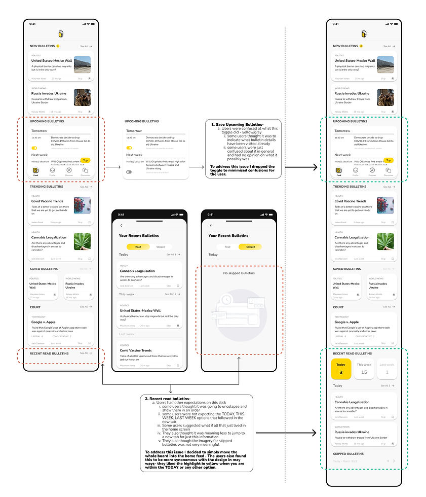
My user tests affirmed the benefits of prioritising ease of use by leaving all information at easy access on the feed, reducing redundant tabs, using memorable iconography and labels and titles that were relatable and not hard to understand
Next steps
Once the final MVP was done and all the iterations were incorporated I sent it out to test once again to make sure my iteration had made an impact. Once that was done I set out a road map for a path forward for a product like this.
-
Polish up the final design to the very last detail and prepare all material and UI elements for a potential future hand off.
-
Work towards a beta version first with a Programmer to realise the product
-
Conduct rounds of beta testing before releasing the product
-
Incorporate an Android update for the same

Conclusion Summary
What I learnt
In this project I learnt a great deal that its crucial to acquire deep subject matter expertise as a designer. Knowing the product and problem to solve for only becomes more easier if you know this. Studying all methods of news delivery and ways to get the audience involved in curating news and open discussions helped me better understand the problems and design for a domain specific use case of finding unbiased news that shows all perspectives under one tool
What I wish I had done
-
Due to constraints I had to make some assumptions and find innovative ways to address those
-
Lot of decisions had to be made on guerilla testing
-
If I had more time, I would conduct more interviews, and observations to deep dive into the underlying motivations and needs
Its been fun ! Insights
The most fun part of this product was solving for something I personally have an issue with - need for unbiased news and non polarised opinions in echo chambers.
Additionally the guerilla testing the prototype and doing the dot method with my users helped me learn a lot as well as a new technique. I enjoyed talking about possibilities and finding potential business goals for a product like this. Its also super rewarding when seeing a product or concept like this grow into something real.