%20(Copy).jpg)
Beauty Brand
What I would do for Sephora's Beauty Brand Application
Disclaimer: this is in no affiliated with Sephora as a brand in any way- i worked on this redesign as an exercise on UI/UX. Additionally worked on a similar UIUX study for Shopping brands Lululemon and Uniqlo
ToolBox: Adobe XD, Figma, Illustrator, Photoshop
Role: UX and UI designer
Exercise Summary:
Sephora is an online and in-store makeup, skincare and fragrance retailer. Until i discovered its ios App I used their Web retail app to do most of my window shopping and product purchases. Once i did discover this application I did prefer using the web app over the ios one because of its counterintuitive and difficult user interface for navigation.
In post covid times AR try on's become more and more valuable and are increasingly influencing the online shopping and beauty space like Sephora's Virtual Try on feature.
Discover:
Goals-
This is when i decided to look at what are my main objectives for a product like this.
-
Better User Experience for Sephora by an improved User Mapping exercise. (User Experience)
-
Reduce duplicate pathways which lead to numerous user slips to get around the product
-
Improve Discoverability for product sales.(Product Designer)
-
Conduct User Research for different user types. (User Researcher)
Research:
Getting to know Sephora and its Users:
I conducted User Research among a target audience who are interested in Sephora and some that are not. I sent out a google form to get data and analyse what pain points different types of Users faced while using Sephoras iOS app. A 5 question survey was conducted to see what their pain points were.
-
find or track your Saved Products, Last Order
-
home screen requirements- what do you look for when you first open this application
-
navigate the Virtual try on and save an image before finding the product of your choice
-
find your perfect Dior Matte Lipstick
Define: User Stories
For this I went ahead and created an affinity map of all the responses I collected from the surveys I sent out and charted them out based on what was most beneficial to the customers and the App Business.

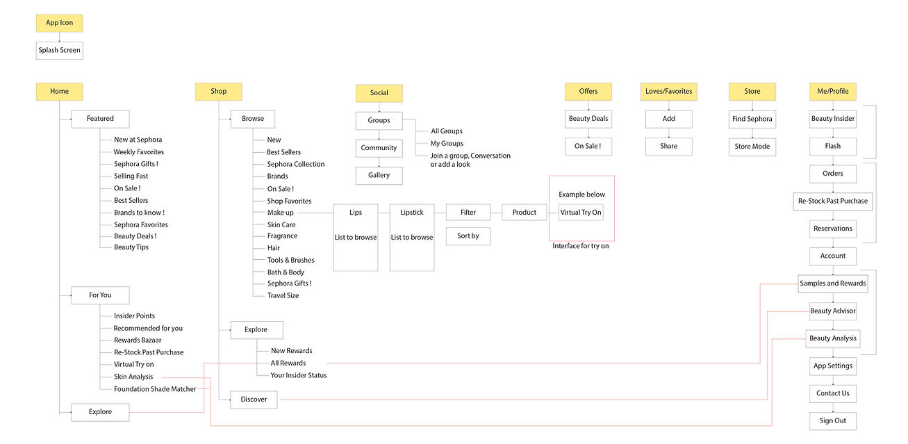
Current App Information Architecture
-
the Red Lines show all the Duplicate Pathways existing in this version

The Good Take Aways from the User Testing:
App interactions are intuitive and are restricted to a tap or a swipe. Controls lie rightly placed on items to help manipulate as needed. The user can locate Under "Shop" or the"Me" menu options rightly placed with all the right signifiers and cues required to find the right product category or other options of your choice. There are additional in-app signifiers for products being added into the shopping cart. These actions remain subtle and run in the background yet leave just the right amount of information for the user using the app to know a product was added in the cart. The lower navigation bar versus drop down menu scrolling is a better feature on apps having so much information that needs to be contained / grouped . Spatial cues for all the controls explicit or not allow the user to best navigate and go through the app purchasing products.
The Bad Take Aways from the User Testing:
Despite the app interactions being intuitive the user mapping has many duplicate pathways which often confuses the user leaving them lost while looking for products or offers. Slips are seen when moving down and into folders and not being able to go back the menu the same way. Some Users came across problem when trying to gauge which pathway from "Shop" or "Home" best offered them the latest and newest products available. The Same problem is seen with the "Offers" tab living within the navigation bar as well as with the shop page navigation options.
Revision on App Information Architecture
-
the Red Lines show all duplicate ways to access buttons without duplicating on the same screen
Revision on App Information Architecture
-
the Red Lines show all duplicate ways to access buttons without duplicating on the same screen
Some of the elements I redesigned from the current sephora app on the left column and the redesigned version on the right.
here you can access the live prototype and the screens re designed ---
