
Clubhouse
A feature to help the user discover valuable rooms
DesignLab UIUX 2021
Overview
This new “drop-in audio” app, allows users to host open discussions or hop around and listen in on different conversations. Users get the opportunity to join a chat and participate in discussions. As an active user, I noticed that the spontaneous nature of Clubhouse that made the app so popular was also what made the experience overwhelming to use.
Role
UX / Product Designer
Research, Information Architecture, Interaction design,Visual design, Prototyping and Testing
Problem
Users are finding it hard to discover the most valuable rooms
Solution
Giving the users more control on universal search to help organise content and discoverability
Timeline
2 weeks
December 2021
Platform
Mobile
For me I found the app experience of connecting with fresh faces outside of my inner circle to have spontaneous conversations was refreshingly human and interpersonal- just what we needed in 2020. But this experience can be very overwhelming in and outside rooms.
Disclaimer: The project presented here are all speculative and for educational purposes only.
The Project
So originally all of clubhouse’s target user groups were mostly silicon valley tech workers, some venture capitalists who were looking to connect during a pandemic, Mark Zuckerberg and Elon Musk to name a few are also users of this platform.
The most hyped app of the year so far. From a design point of view, it’s not straightforward, since images and video generate more interest than sound and emojis.
1. Set up high level goals and objectives
By setting up these high level goals I know I am solving the problem for a mobile device and the objective and challenger I'm focussing my study on is improving - discoverability, navigation, event page content
2. Define the problem/ problems to solve for
Here there can be related problems that all fall under a bigger umbrella to solve for or multiple small problems that have to be solved with product updates or product feature additions
3. Create a feature to solve the problems identified
With the dominating rise of news aggregators and people preferring multiple sources of news, it becomes difficult for a standalone news company app to get users to read & stick on their platform more.
"
For me the most overwhelming experience was how might a user find or discover a connection with a potential community when they cannot locate them?
"
Research
Understanding Clubhouse
In a nutshell, clubhouse allows you to follow topics, and based on that you will be suggested rooms in which you can voice chat with the rest of the audience. It is like a podcast where everyone can chip in. How does it make it any different from other social media platforms like Twitter — is that you don’t have to spend time synthesising your thoughts into (limited) text. Rather you can be more impromptu and engage more efficiently with the rest of the audience.
As an early user on the invite-only platform, I had the unique perspective of following the product's updates (and exponential success) in real-time, and sought to challenge myself with an ambitious project : redesigning Silicon Valley's most exciting app in recent memory. No pressure.
Key benefits
Key Clubhouse benefits for users is having an exclusive audience that has some kind of exclusivity and members only feel. It has the potential to help brands develop thought leadership
Target users
Most users of Clubhouse are 22- 45 years of age and are mid career
Competitive analysis
To have a better sense of what makes clubhouse standout in the competitive social media non profit supported by venture capital firms and what features potentially create opportunities for its growth , I researched other social media platforms

Twitter vs Clubhouse
Twitter has more retention over the last few years than clubhouse has over the last one year. Twitters retention is based on how a user is able to curate their feed, participate in discussions and be drawn back to the product.
Twitter free to participate and comment
Clubhouse you need to be invited or allowed to speak
To Conclude
01. First hand experience
02. 1-1 User interviews with novice and regular user groups
03. App store reviews and feedback
Understanding the Users
In order to further understand users and have a better sense of how people are finding rooms to visit and listen to or just trying to have the opportunity to speak or set up events so they know what is upcoming, the user interviews were conducted.
My goals are to find out-
-
My goal is to use my experience on this application to highlight some of the challenges and issues I face while I use the application as an audience member.
-
What does the user look for and how does a user find value on Clubhouse? I wanted to get a clear picture of how users are navigating Clubhouse and had to better understand their behaviour's and motivations.
Participants
I did these interviews over zoom with 5 users 3 of which use the application very regularly and the other 2 used the application for the first time when I asked them to.
First Hand Experience
This application has a lot more room to grow. I am a relatively (2 times a week) regular user of this platform and know what they have to offer in its current product state.
Challenge highlights for me-
Navigation- Discoverability
For me when i just began using clubhouse a few months ago I had to google how to use this app because my hallway was completely empty and I had no idea what to do next
Events page-
Disorganised
For me this page is overwhelming- big bubbles with unrelated title and subtitles, I wasn't sure what I should be understanding from this page.
Search-
Limiting
For me this was a huge issue- I was able to perform a search only 2 ways innitially-
Follow people but it's not guaranteed that the room is in your interest.
Follow clubs but you will only be notified if the club hosts a room
*Now you can search by room and events as well.
In terms of UI the search doesnt help me see the information organised
Hallway analysis

Active Room

Search

App Store Reviews
The app currently has about 600k user reviews- this was as absolute goldmine of information to understand other issues apart from the ones I was facing while using clubhouse already and were common problems for them.
This helped me identify some pain points, opportunities and goals for research further during my one on one interviews.
What gives a user more control over their experience within the context ?
What users are looking for when they attempt to search and how must the organised content increase discoverability?
What helps the user commit to joining a room having a discussion?
1:1 Interviews
I did these interviews over zoom with 5 users 3 of which use the application very regularly and the other 2 used the application for the first time when I asked them to.
This allowed me to identify some common themes after examining all the data I assimilated.
New Users
-
New users are unsure and follow interests, groups, and people randomly, which lead to a cluttered hallway/event page with irrelevant rooms suggestions.
-
The influx of Clubhouse notifications can be way too excessive and irrelevant.
-
There was no quick way to eyeball a verified user so it made it hard to determine if the room or user is worth following
-
The explosive load of information lacked and visual coherence and users were looking for a sense of visual hierarchy to help them read the event and about it
-
Basic navigation difficulty
Existing Users
-
Users were discovering people and groups to follow only by going down a rabbit hole from other user’s bios
-
Users were finding it hard to get context of what conversation was happening when entering a live room
-
Users were finding the search ability irrelevant and seeking more information.
-
Navigation difficulty by even the users using this app often

Key Insights
Users were experiencing difficulty navigating through the app. The app is simple and straight-forward but it lacks some major and critical elements. I found my priority is to focus on designing an enhanced experiences by solving these issues:
Detailed affinity mapping - click here
1
Lack of UI memorability and visual hierarchy
2
Clearer room search-ability
3
Cluttered event page and hallway
4
Difficult navigations and discovering content
5
Users unable to engage
Define
Persona
I created two personas one for users looking to be a moderator and users looking to be part of the audience and have the option to speak.
I found that while there are rooms dedicated to so many varieties of topics but, the majority of the users are more likely looking to utilise the platform for only networking professionally.

Feature Analysis 💡
Using the research results I created a feature matrix
This helped me narrow down my solutions and ideas and categorise them under tasks that will be performed by the user.

Task Flow
Predominantly there are two distinct flows within clubhouse.
A user can either choose to be a moderator or an audience depending on their goals and needs. Recognising that each flow is unique to its roles, I tried to dive deeper to understand each flow and perspective and see what major differences are there between the two.
Eventually- the goal is to resolve flow for both


Ideate
Lo - Fi Wire Frames
Complexity
This is this is some of the frames I created for the first version of the product. I came up with multiple versions following this and used the crazy 8s method to finalise what the wire frame would be.

Mid - Fi Wire Frames
I presented the lofi wireframes to my mentor and other designers in a group critique session. I received valuable feedbacks and made below iteration.
The screens below are mid fi and show changes made
-
Hallway - got rid of search from the bottom nav and made it a permanent feature on the top of the Hallway screen
-
Search- removed the event search option and reduced redundancy by keeping it in one location
-
Re visited the layout of the search results to display all information that is crucial to the room success metrics
-
Re designed how the events tab lays out to leave enough bread crumbs to back track where necessary
-
Re organised the profile tab to maintain memorability and familiarity to other apps having profile tabs.

Complete wireframe
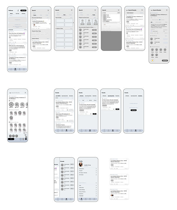
Prototype
Hi - Fid Interfaces

Prototype Testing
Then it was time for Users to test the product out!
I created a single prototype with tasks to fulfil in Figma each of which was tailored to a specific ask by mapping clickable paths onto the most recent iterations of my hi-fi wireframes, creating interactive product examples that users could interact with.
The full prototype can be accessed here.

Hallway and exploring the bottom navigation functions
-
Here the user explores the hallway
-
Look at profile
-
Friends tab for chats
-
Events tab

Look for Mindful Meditation room

Learn about the room
-
This allows users to know all information
-
Additionally users can see what they can expect in a group like this
-
The rules will cover what can and cannot be done in this room

Enter room
-
put yourself in the waiting room to speak next
-
show your 'reactions' to the group by posting!

Add an event
-
search for the event of choice and add date and time
Prototype Test
Testing
I conducted a round of testing at different points of this 2 week design sprint. I conducted this between 5 users and the same 5 at different stages.
All expressed that the design was easy and intuitive to use. They had no particularly large changes to address except for the RSVP button to be made pixel perfect in terms of size - which I did immediatele in the early tests
Summary
I would totally use this feature if it were in Clubhouse
Testing participant -regular user
Its straightforward and feels like ive been using this for a while and already know where everything is
Testing participant -novice
Design can be messy and complicated
In this project I found it easier to find solutions once I broke the problem down to smaller parts. No one shoe size fits all- the same way one solution would not resolve all the app problems.
This also helps me focus on a single problem at a time.
In this project I used Iteration technique earlier in the process and i now realise design is a never ending process of testing, iteration and repeating this.
Users are the main sources of insight
Even though I used app store reviews and my own expertise - it was good to be able to get my focused feature map once I had my users verdict. Understanding how the users interact with the product in various tasks helped me hone in and focus on the user needs and their goals.

Retrospective